
DATS Design Trends on Social Media 2022
We shouldn’t follow design trends. Here’s why, according to our social media and content exec Lucy.

Staying on top of trends keeps your content fresh BUT it can end up looking the same as everyone else’s (especially using templates such as those on Canva).
We shouldn’t follow trends at the expense of your brand guidelines and aesthetic.
Clunky design often gets in the way of performance, so keeping a balance is key.
1. Modern Gradients
Gradients are nothing new, using them add depth to your content and can completely change a design.
It can be bold or subtle, the focal point of a design or a background element. Because they mix and blend different shades of colour, gradients can create new colour combinations that feel different and modern, lending a completely unique feel to designs.
New gradient usage on social media will include shapes, loose swirls, grain and dialled up colour contrasts.
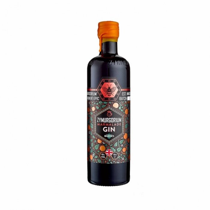
2. Flourescent Colour Palettes

From neon green to acid yellow, fluorescent colour palettes are infiltrating every corner of Instagram – bringing a perfectly progressive, Gen-Z aesthetic to the table.
As these colours can be quite ‘in your face’ it’s often better to tone them down and mix in with other colours.
3. Barely Readable Fonts

Spotify confused users back in 2021 with their hard to read genres from ‘Spotify Wrapped’ with some people thinking it had glitched. A lot of people hated it, but it caused people to talk and the design became as discussed as the actual music listed.
Taking Spotify’s design as inspiration and not literally, we see experimentations happening with different typefaces added to a single word or sentence. Or different effects too.
This isn’t right for all brands but can be a fun and rebellious look on event posters or launches.

